Monday, 23 February 2015

Agency Examples: Handsome Frank

Handsome Frank is a UK based illustration agency born from a conversation between two cousins in a pub - it has blossomed into a fairly successful agency, representing 30 illustrators spread across five different continents, even working with some of the biggest brands in the world.

Despite their size, they like to keep the feel of their agency small (almost boutique), as they appreciate the personal feel and prefer to get on closely with each other - making sure both the agents and the illustrators are both happy with what they are doing.

Examples of their illustrators work [taken from here]

Matt Saunders: 


Sarah Maycock:


Helen Musselwhite:

Agencies

It is important, for any kind of artist, to understand exactly where they fit into the industry and how to best represent themselves to the consumer. For this, agencies are very helpful and (especially to graphic designers) are downright essential. Typically, those who are employed by agencies, similar to design houses, will work within the house style, however those who prefer freelance work and for themselves to be represented by an agency, they provide their own style - their own 'voice' to use, so to speak.

Agencies, however, are not exactly alike to design houses. Typically, design houses can offer a lot of collaborative work between their artists - agencies, on the other hand, are simply there to represent and offer artists up for potential clients.

[Source for the following information: http://www.digitalartsonline.co.uk/features/creative-business/how-get-illustration-agent/ ]

Agencies are completely optional but extremely essential to any artist looking to expand their horizons. They can help push for higher commission fees, help find many clients for you, and frees up time that would otherwise be spent trying to advertise yourself to potential customers.

You really need to research into any agencies you are planning on joining - you need to ensure that your work fits their profile, you are interested in the projects they can offer, and that they are willing to support your work for a fair amount of time.

Agencies typically look for artists who have already established their own style or it is apparent in their work that they have a clear direction in which they are heading. They need to know that they can market you and your work clearly to the public. It is also important that the artist is capable of team playing; oftentimes, agent and artist will be working alongside, and if the artist is unable to co-operate, that will make difficulties for the agency.

When first signing up to an agency, often they will already have a flat-rate sorted - that does not mean that the price of your work will not change according to how you progress. Flexibility within this is important - spikes in price will throw you out of the area of desire for clients, but too low a price will seriously undermine your work. Catching the balance in this situation is key.

Freelance Artist Examples

Mr Xerty [Mr Xerty's Portfolio]

A freelance graphic designer/illustrator based in Paris, France. Self-taught, he originally experimented with graffiti before settling down with graphic design and photoshop. He used to work as a graphic designer for an automotive company before deciding to turn to independence, and has since worked for clients such as Sony and Fotolia. 
His style is influenced by urban life, underground culture, and vintage styles (all very visible influences throughout his work). He likes to play around with textures, colours, and - most of all - 3D shapes. His work explores the surreal, leaving behind bizarre landscapes from vivid imaginative scenes.

Example of work taken from here.

Iguanamouth [Iguanamouth's Blog]

I found no information available online about Iguanamouth, so I emailed her requesting a small interview - the request has been approved and the following questions have been asked:

1.What media did you originally work with before digital?
2.What are the main influences for a great body of your work?
3.Could you possibly share a brief look at your creative process?:
4.​Has your work ever been plagiarized?
5.(If yes to the above) How did you deal with this and was it resolved?
6.What kind of reaction are you typically looking for from the people viewing your work?

Her Reply:

1. Well digital drawing was sort of something I've always kind of messed with growing up - I've spent a whole lot of hours fiddling around in MS Paint and scanning bad anime characters into photoshop, so there wasn't really a sudden transition between traditional and digital media that I went through, but before I picked up a tablet a few years ago and was finally, FINALLY able to get out of drawing with a mouse, most of the things I did were either inked and painted in an enormous sketchbook, or scribbled in the margins of homework from when I was still attending school.
 Honestly the whole freelance thing is relatively recent for me, and it wasn't until last year that I could even really consider supporting myself entirely through art - I just sort of fell into it!

2. Monsters! Mythology! Magic! Other words that start with M and fall into the same categories! There really isn't a specific person or collection of work that I go to for ideas or anything, but the idea of the unreal has always been fascinating. You've got the potential to create entire universes out of nothing, make characters and concepts that only exist in one space and thus follow the rules you set down for them. Even if i never actually flesh anything out beyond a single design, just making something that doesn't and can't possibly exist in this world is incredible! 

There were definitely books I had growing up that were a huge influence on my interests though - Ken Sugimori's original Pokemon watercolors were the peak of art, as far as 10-year-old-me was concerned. Then there were the illustrations from the Dragonology handbook - I spent a lot of time in my early teens trying to emulate that style.

3. Aha, geez, there's not really a lot to say - mostly things spawn from a single idea, or another persons' drawing prompt, and I end up spending the next 20 minutes reworking a messy sketch until I can sort of see where the lines will fall. It's definitely not a clear-cut process either, as if each step was a series of points on a straight line that I have to work through. Sometimes I have to change everything halfway through colouring because I've had another, more interesting idea. Sometimes I spend over an hour just working on the sketch because I can't get the damn thing to look right - it's a lot of trial and error, probably the same as anyone!

4.-5.  Well while I've never had anyone outright trying to claim they drew something of mine (or if they have I don't know about it), every once in a while I'll get a message from someone saying so and so threw up something of mine without credit up on their facebook or tumblr or what have you.

I don't really mind much as long as my url is up on the image somewhere, but there was one person on imgur, who posted a fairly large comic set I did with two of the panels in the wrong order. And the page got really popular! So thousands of people are probably out there thinking "HUH WOW THIS SURE WOULD'VE READ BETTER IF THESE TWO THINGS WERE SWITCHED AROUND WHAT A DUMB MISTAKE THAT ARTIST MADE" but I didn't!!! I didn't do it!! It wasn't me! They never responded to my pleas to put them in the correct order, either, so I'm sort of just resigned to it. Oh well.

6. Either "this is great" or "what the hell is this". That's it. There are no other favourable outcomes. Its' either a positive response or outright confusion, and I love putting a ton of time into ridiculous ideas that should never get off the ground. Recently I did a twenty plus panel fully coloured comic on two memes having a wizard duel. Life is incredible and weird and I'm just glad to contribute.


Example of work taken from here.


Wednesday, 18 February 2015

Design House Examples Pt. 2

Sawdust [Sawdust Website]

Another small studio of only two artists, Rob Gonzalez and Jonathon Quainton focus their work on typography, image-making, and visual identity. Their studio is based in London, UK, and have worked for such companies as:
  • Coca-cola
  • Universal Music
  • John Lewis
  • British Heart Foundation
  • New York's Time Magazine
...and many others. They have worked for a fair amount of large names with high quality pieces of imagery.

Their work seems a lot more clinical than some of the other studios that I have looked at, appealing more to the monochrome or plenty of white space audience rather than other viewers.

Example of work taken from here.


Nobrow [Nobrow Website]

Nobrow is a very successful design house in the UK, formed in the winter of 2008 with the aim to create a platform for graphic designers, illustrators and comic artists in the UK. This was considered the age of 'dying print', and to stand out, the company had to bring about something new, their images had to deserve to be printed and to really bring something new to the table in such a hard time for new artists and companies.
Using spot-colour and the finest inks they can buy, they create some of the most lucid prints that you will ever see, creating quite a vivid library of spectacular colours to look at. For such a recently formed company, they are very successful in that their prints are now being distributed world-wide, their most recently formed Nobrow France published Hilda et la Geant de la Nuit, which received widespread approval in the press and made an appearance on French national television.
They have a smaller arm, Nobrow Small Press, in which their books are hand printed of roughly 100 copies by hand through screen printing. 

Nobrow is a fairly large studio, proudly featuring 35 artists, all of which repping their own style - though the styles are similar, they do deviate from one another and showcase their own characteristics that set them apart from eachother. Each artist within this studio has their own way and pace of working, for example, Ray Lemstra prefers to work intuitively, not focusing on concepts too much, whilst Kyle Platts spends a lot of his time portraying his ideas, constantly carrying his phone for notes and his sketchbook on him.

Example of work (by Bianca Bagnarelli) from here.


Design House Examples Pt. 1

DKNG Studios [DKNG Website]

DKNG studios revolve around the two artists; Dan Kuhlken and Nathan Goldman. They were drawn to film, music, and design at early ages and set up DKNG in 2005. They both have diverse skill sets ranging from fine art to film projects - they strive to provide their clients with the artistic style and recognition that they deserve.
Catering to the entertainment industry, their services include (but are not limited to):
  • Packaging Design
  • Print & Poster Design
  • Apparel Design
  • Custom Illustration
  • Web Design & Development
In an interview, they are quoted to answer the question 'What advice would you give designers who are looking to start their own business?'
"Portfolio first. Don’t start any business just because you have the tools and/or talent. You need finished product to prove your worth. We believe that most great business organically creates itself based off of one’s passion for their work. Don’t be afraid to work for free if it means it will lead to a stellar portfolio piece. But also don’t forget your worth. You really have to love what you do in order for it to love you back."
For their creative process, they rely heavily on concept - planning is key to their style, as it turns something good into something breathtaking. Dan is the more illustrative of the pair whilst Nathan focuses primarily on typography and graphic design. It is a belief of theirs that the two minds collaboratively help to create solid final pieces.

An example of their work, taken from here.


Shed Labs [Shed Labs Website]

Shed Labs is a design and illustration studio based in Greenville, South Carolina. They focus their work on the beliefs that ideas come first and execution/craftmanship is vital. They take each project as seriously as the next, no matter how big or small, or how important the client is.
The studio is three strong, comprised of Wellington Payne, Robbie Cobb, and Beau Bailey, starting quite literally in a shed with screen printing in 2009.
Their passion through their work comes from the ability to bring their ideas to life.

An example of their work taken from here.

Industry Structures - What are Design Houses?

Design houses are companies of artists that deal with clients both externally and internally. They typically work with an in house style (a shared style that the artists adapt) underneath a creative director. It is generally extremely difficult to get into a design house that allows you to keep your own style (a house such as NoBrow).

[Following information from here]

The art market exists only in cities where the capital attracts economic activity towards the market, with the U.S. leading 50% sales of contemporary artists. The current market is experiencing an influx of buyers from younger collectors - this is a new demographic that is good for the artwork and, in turn, design houses. It is from this information where we can source design houses; they will be situated where the most work can be found.

Some examples of Design Houses are as follows:
DKNG Studios
Shed Labs
Sawdust
Nobrow

Mapping Out Illustration Points - The Cats of Ulthar

Rather than pasting the whole story here (though short, it is still too lengthy to place the whole thing in a blog post), I will give a brief summary of the tale, with a few lines from the actual story presented here.

Story takes place in Ulthar, which lies beyond the river Skai - here, no man may kill a cat. The cat is cryptic, he is the soul of Aegyptus, bearer of tales from forgotten cities in Meroe and Ophir. Kin of the jungles lords, cousin of the Sphinx and he speaks her language - but he is more ancient still.
An old man and a woman, for no known reason, slew cats that wandered at night. Nobody confronted them for fear of both their faces and their dark and dreary cottage. Villagers simply prevented their cats from leaving the house at night.
A caravan of strange wanderers from the South came to Ulthar. They were dark, and unlike any wanderers the villagers had seen before. Their wagons had strange figures with human bodies and the heads of cats, hawks, rams and lions painted on the sides. The leader wore a headdress with two horns and a disk between them.
An orphan named Menes traveled with the wanderers, the plague taking both his parents and leaving him alone with a tiny black kitten. He smiled often, playing with his kitten on the steps of one of the strange wagons.
On the third day of their stay, Menes lost his kitten, and whilst he sobbed and searched for him, the villagers told him of the old couple. He stopped crying and began to meditate, then pray. He turned to the sky, stretching out his arms and prayed in a foreign tongue whilst the clouds began to form odd shapes. Hybrid creatures with headdresses similar to the travelers' leaders' began to form in the sky.
That night the wanderers disappeared for good from the village. All cats within the village also disappeared. Old Kranon, the burgomaster, swore that the wanderers had taken the cats away in revenge of the killing of Menes' kitten. No one still bothered the old couple, even when Atal, the innkeepers son, told of his sights of all the cats of Ulthar in the couples' yard under trees, pacing very slowly around the cottage, two abreast, as if in performance of some unheard-of rite of beasts.
On the fourth day, the villagers awoke to find their cats back in their houses. All of the cats were bloated, purring with content. They refused, for two days straight, to touch their meals or milk.
It was a week before the villagers noted the lack of activity in the dark cottage. Neither man nor his wife had been seen since the night the cats vanished. After another week, the burgomaster (accompanied by the blacksmith and stonecutter) broke down the cottage door. They found the couple, cleanly picked of flesh, skeletons on the floor with beetles lingering in the corners. It was for this that the law of no man may kill a cat was passed.

Again, before planning the final illustrations, it is important to look at the points in the story that could make for a good illustrating opportunity.

Following is a list of possible illustrations:
Set the scene: create an image of the small village past the river, give the audience a place to picture.
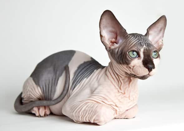
The cat is cryptic, the soul of Aegyptus, bearer of tales....(etc.): show the cats in a position of graceful power, make the viewers wonder why deaths within the felines are happening.
The wandering caravans: the strange figures painted on the side and the appearance of the leader make for an interesting image. Picture (maybe in the centre) Menes playing with his small kitten.
Menes sobbing and questioning the villagers - immediately followed by his chants to the sky - could make for a dynamic scene with some interesting lighting and angles.
Picture the scene that the innkeeper's son described - the cats seemingly in ritual in the shade around the cottage.
Maybe the bloated cats by the fireplace? It would be interesting to place some of the beetles later found in the cottage in these earlier images.
The villagers surrounding the inactive house, immediately followed by the three men breaking down the door to find the skeletons with beetles scattered about. Perhaps include Menes' kitten as a subtle feature of this image.
The villagers discussing amongst themselves what was seen, and agreeing to outlaw killing cats.

I feel I could gather at most 10 illustrations from this tale - giving me a total of 15 pieces to plan. This gives me a lot of leeway, as if I feel some of the pieces will not work as finals, I can strike them out safely whilst still meeting the minimum.

Mapping Out Illustration Points - Night-Gaunts

Out of what crypt they crawl, I cannot tell,But every night I see the rubbery things,Black, horned, and slender, with membranous wings,They come in legions on the north wind's swell,With obscene clutch that titillates and stings, Snatching me off on monstrous voyagingsTo grey worlds hidden deep in nightmare's well.
Over the jagged peaks of Thok they sweep,Heedless of all the cries I try to make,And down the nether pits to that foul lake,Where the puffed shoggoths splash in doubtful sleep.But ho! If only they would make some sound,Or wear a face where faces should be found!
Before I even think about my final illustrations, I have to consider which points in this poem to actually illustrate - this will also tell me whether or not I'll be able to meet the minimum of ten final pieces without choosing another tale.

A list of the possible lines I could illustrate:
Out of what crypt they crawl, I cannot tell,
They come in legions on the north wind's swell
To grey worlds hidden deep in nightmare's well
Over the jagged peaks of Thok they sweep
Or wear a face where faces should be found

It's interesting to point out that the fact that these creatures do not have faces is mentioned last - perhaps, of all the illustrations, I should dis-include the head only to reveal their facelessness in the final image? From this poem, I feel I could derive a maximum of 5 final illustrations. With both this poem and The Cats of Ulthar short story, I would like to plan a possible 12-13 pieces, just in case I decide later on that one of the images will not work as well.

Inspiration Spotlight

It is difficult to think of ways I could represent my work without coming too close to the necronomicon official illustrations - they very much suit the style of writing, the time the tales were set in, and the whole horror/macabre genre in general. Whilst I want to diverge from this kind of traditional style, I do not want to venture too far into another genre - I want to keep it very recognisably horror.

With this in mind, I sat and thought briefly about how I could go about this, remembering an artist I'd used for past inspiration: Deth P. Sun.


(Images taken from here )


Sun's style is interesting in that it is quite simplistic yet the pieces overall remain fairly detailed - lots of use of linework coupled with the block colours add a 'naive' feel to their work. I feel I could take great influence from these pieces in looking at their techniques - it gives me a way to retain the horror style whilst not sticking too closely to the official illustrations.

Thursday, 12 February 2015

Cats in Horror Illustration

Similar to the artist research for the Night Gaunts, I want to look at the ways in which cats can be represented in macabre settings - the representation of something so everyday needs to be changed into something that the audience are perhaps not as used to seeing, and in this post I want to look at the ways that different artists do this.

(The following artists can be sourced on http://behance.net)

Ben Rennen

This piece seems Halloween themed if anything, with the portrayal of a black cat in front of a carved pumpkin - however, the markings on its face set a strange tone as towards the mouth it seems like some very sharp and disfigured teeth. Something else to note is the size of the paws, ears and eyes - parts of the cat that work most well for them have been highlighted - especially their keen senses and sharp claws - in this image.I particularly like the use of colour - despite the cat being black, highlights are yellow-hued and the main body of fur seems to be a deep bottle green.

Paolo Pianu

This piece was created through the use of black ink and watercolour - though the smudged, rough edges make it appear more-charcoal like in its textures. The composition of the cat resembles a skull - with the low set jaw and teeth all on display - the most bizarre part of this piece being the missing right eye; upon closer inspection, impressions of the iris and pupil are visible suggesting that the eye was originally there and has been coloured over. It could have been for a multitude of reasons, a mistake, simply a dark eye, maybe it was never intended to have been there; but for whatever reason, it seems to make a nice effect, almost a battle wound.

Katherine Jackson


Largely a normal cat (though the markings of the fur appear to resemble a form of crown, maybe symbolism?), it is the posture and colour scheme that makes the subject of this image eerie. The blue/black fur sharply contrasts with the glowing yellow eyes, and the looming/overlooking form of the cat seems very sinister. The lighting makes a great effect too, the light of the moon brightening the atmosphere around it and creating some interesting tones on the cat.

Necronomicon; The Cats of Ulthar; Cat Breeds

I've picked two tales to illustrate so far, the second being The Cats of Ulthar - this story tells a tale of an old couple who killed cats until they ended up killing the wrong cat; from this point, every cat in Ulthar kills and eats the couple - as it would imply in the name, this story focuses heavily on the feline race, and so to create more effective imagery, I would like to look at different breeds of cat that I could use in the illustrations

American Curl (Image Source)


The ears resemble horns, and the characteristic light fur colours of this breed would make a good backing for blood stains.


Bombay  (Image Source)

For the simple reason of superstition; the only acceptable fur colour for this breed is black (as old folktales go, black cats symbolise bad luck). The contrasting bright yellow eyes could make for some good colour splash opportunities.

Cornish Rex (Image Source)

Very similar to the sphinx breed in body type (sphinxes typically unnerve people) however, accompanied with strange fur texture that would be interesting to draw.


Sphynx (Image Source)

As mentioned before, sphinx cats tend to unnerve people - could easily be drawn in a horror/macabre light, with slender limbs and tails slightly exaggerated.

Norwegian Forest Cat (Image Source)

Presented alongside the average sized housecat, the norwegian forest cat is the black haired one on the right. The size of these cats is impressive, with huge paws and claws that look like they could do some serious damage.

Munchkin (Image Source)

In using these cats, I would hope that their permanent kitten faces and cute features would unnerve viewers in the same way that child-like monsters (such as changelings) are used in horror/macabre.

Turkish Van (Image Source)
It is required of this breed that the main body of their fur be coloured white - again, an interesting backdrop for blood stains. What sets this breed apart, however, is their natural love of water; something I hope to use to unnerve viewers - it's strange to see a cat swim.

All of the above breeds are possible candidates to be featured in my illustrations - though I am not limited to one, I would not like to use all of these breeds as I feel the vast range of body types and features may detract from any pieces (however this is just my decision for now and is susceptible to change). All of the breeds have their pros and cons, though I will make no decisions until I have studied drawing them all.
For primary observation regarding the cats, I have cats of my own whose expressions and body language I can study for reference.


Necronomicon; The Macabre Effect

The category Horror & Macabre has been tackled by many, many different artists - styles may be similar and influence eachother but no two styles of developed artists is quite the same. I wanted to look at the range of ways in which illustrators and graphic designers have presented the horror & macabre effect, to prevent myself from staying within the bounds of older looking illustrations and not be sucked into the trap of sticking to the same sort of scheme laid down by the illustrator of my copy of the Necronomicon.

(The following artists can be sourced on http://behance.net)


Jose Trigueros


The sphynx image works well as a reference for me as it can be tied in with "The Cats of Ulthar" - one of the tales from my book that I have chosen to illustrate. Trigueros' work seems to be quite rough, with very visible brush strokes - not always is it dark but it usually seems to have a set scheme of colour; muted as a general observation of all pieces, but each individual piece has an overall feel to it. Trigueros either goes for 'warm' colours or 'cold' ones, rarely combining a mix of the two for an uneasy contrast (whenever he does, it is clear that one set of colours is more dominant than the other).

Monica Valentine
Though her style stays the same throughout Valentine's works, some of her pieces are clearly more detailed than others; whilst yes, she stays within the region of monochrome (which is something I wanted to explore outside of for a little while), it's interesting to note her usage of pointillism - a small yet noticeable change in contrast to the imagery featured in the Necronomicon. It makes for a more realistic style of shading, her pointillism pieces appering much less cartoony than others. Combine her techniques with what she actually illustrates (here shown a multi-eyed cat and an x-ray view of a bat), her pieces make for some unnerving artworks. One of my favourite features exhibited through her work is the use of simple block colouring alongside detailed dot-shading; the heavy border black shown as the bats body almost acts as a frame and shows the work with a more completed feel.

Charlene Chua

Chua is very interesting in that the main body of her work is PG and family friendly - however, a commission for a T-Shirt design from the clothing company 'The Cult of Original Sin' has brought out a dark side in her work - it almost goes to prove that any style can be adapted to fit any genre, using certain characteristics and colour schemes. This is one of my personal favourite pieces I have found so far, the muted green/cream block colouring with cell shading combined with the almost luminescent crimson reds makes for an interesting piece, each section so aesthetically pleasing with its surprising dependence on colour to create further detail (imagined without the colour, the piece itself - though complicated - is not actually that detailed with just line).

Eugen Poe

The majority of Poe's works are completely monochrome - black and white series of pointillism. However, after looking at Valentine and Chua's work, I felt inspired by their style and Poe's work was a perfect combination of the two (of course, well within his own style through his complete realism). The block colour splash of single hues through his rare duo-toned pieces work surprisingly well, the less detailed areas only working to serve the purpose of really highlighting the detail of other areas; only by seeing the simple parts by the complex do we really appreciate the effort which has gone into his work.

David Lupton


It's been proven by the artists mentioned prior that bright colours can work very well in macabre pieces; how about muted, more earthy tones? In the above piece by David Lupton, the flesh tones and strange grey markings make this image very unnerving; more than anything, the unknown is feared, and this image leaves a lot to the imagination. It raises many questions, which sets the viewer at ease, and there are no bright colours to distract from the distorted (almost completely disfigured) face.

Heather Yu

What makes Yu's work more unnerving than anything is the use of body dismorphia - disfigured features can be used for shock value, as human society tends to lean more towards vanity than anything; and what's more scary for the human race than something that absolutely cannot be perceived as beautiful? No matter how you look at it, this creature is ugly, definitely threatening with its rows upon rows of teeth (a characteristic of sharks, something that people are generally afraid of). The legs seem spider like (again, another common phobia) tapering off into blood-coated nothing. The splicing of creatures combined with gore seems to be a favourite among those who illustrate horror; though nothing too much, the idea of something is much more eerie than presenting everything before someone, imagination can do much more damage than imagery.

Representation of Night Gaunts

To really get a feel for how I want the night gaunts to look, I've searched the internet for the representations of these creatures through the eyes of other artists.

Julia Griffin 

A monochrome piece, the night gaunt seems to be very simple and just a silhouette - ideas for how to represent them as black without making their skin actually black?

Melissa Chiu

Muted colours though all related to the colour of wounded flesh (looking sore or bloody). The wings actually don't have a function and the horns are mis-matched.

Marc Tremblay

Despite being described as slender in the poem, this version seems quite well built - however in relation to body fat, there is none, muscles and other anatomy is clearly on display.

Wednesday, 11 February 2015

Necronomicon; Researching my Stories - Night-Gaunts

Out of what crypt they crawl, I cannot tell,
But every night I see the rubbery things,
Black, horned, and slender, with membranous wings,
They come in legions on the north wind's swell,
With obscene clutch that titillates and stings, 
Snatching me off on monstrous voyagings
To grey worlds hidden deep in nightmare's well.

Over the jagged peaks of Thok they sweep,
Heedless of all the cries I try to make,
And down the nether pits to that foul lake,
Where the puffed shoggoths splash in doubtful sleep.
But ho! If only they would make some sound,
Or wear a face where faces should be found!

As this literary piece is a poem rather than a story, it is really open for interpretation and should not be taken literally as it is written. The poem would have you believe this is a manifestation of something that is actually happening, however once you analyse it for what it is, it becomes more apparent that Lovecraft is speaking of the phenomenon of recurring nightmares - no matter what night it is or how he tries to fight it, they always happen.

Considering this poem gives a fairly detailed description, it would be difficult to create the image of a night gaunt whilst making it much different from the official illustrations of the necronomicon, so rather than taking all of the description literally, I have decided to explore different ways I can represent them:
Black - rather than being coloured black, I could turn this into a reference to black magic.
Wear a face where faces should be found - relocate the face maybe?
Membranous wings - don't have to reference to bat wings or similar, think about placements and practicality.