It has been a very intense start to the time I'll spend on this course - we've definitely been thrown in the deep end and I feel I've done well with the pressure and learned to swim.
For starters, and the main point, I feel the sheer amount of drawing and new experiences I've tried over the past few months has definitely improved my drawing abilities and the style in which I draw - comparing my first sketchbook to my last shows vast change and improvement.
These images both took roughly the same amount of time, the one on the left is from my first project whilst the one on the right is from my most recent project
I feel like this module has also helped me come to terms with dealing with a larger workload and coping better under pressure - if I have been taught one thing it is definitely to not procrastinate, I found this out the hard way. This has definitely been my major downfall with this module - leaving a lot of things until last minute, otherwise I'd say I did fairly well with most aspects of the module.
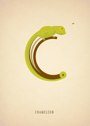
I most enjoyed the subjects of animals and digital; both new things to me, as I was not used to drawing animals nor with digital media.Overall, I'd say the past few months have benefited me greatly, and despite procrastinating, I don't think I'd change a thing about my experience.
Blog related to the workings of an Illustration student - artist studies, references, research, etc.
Wednesday, 14 January 2015
Tuesday, 13 January 2015
Tiny Frog
With this piece I used a drawing I did during the animals module - it was originally created through traditional methods, I then uploaded it to photoshop and cleaned it up a little bit through making colours more vivid. Some of the details, however, were removed in the process - I much preferred to create the whole thing through digital means.
(Original)
Book of Drawings Module Artist Views Pt 3
Julia Badeeva
An illustrator based in St Petersburg, Russia. I started to look at this artist because one of her pieces of work caught my eye - it fit in well with my "animals doing strange things" idea, in that it was a deer creating a dreamcatcher with its antlers. The sheer amount of detail into this realistic looking piece also attracted me, and it was through this that I retained inspiration to create my pieces using pencil.
( Behance )
Doeke de Walle
An illustrator based in Munich, Germany. This artist created an interesting effect using line rather than just tone to make their images seem 3D - almost a more simplified version of using contouring lines. Though the images seemed angular, this did not detract from the idea of movement, and it was this unique, strange effect that brought me to this artist.
( Behance )
Book of Drawings Module Artist Views Pt 2
(I quickly moved on from characters to animals, so the rest of my studies were looking at artists of animal themed pieces)
Elicia Edijanto
An illustrator based in Jakarta, Indonesia. Their pieces are extremely simple yet effective - using ink and water to create a vast amount of shading and tone, the atmosphere to their pieces is almost gloomy; however, the narrative behind each piece detracts from that mood and makes it more naive. It is this weird contrast to the feeling in each of their images that drew me to this artist, one of my favourite so far.
( Behance )
Marcus Reed
A graphic designer/illustrator based in London, UK. It is his "animal alphabet" series that I will be looking at - extremely minimalistic with block colours and little shading, he used animals of corresponding names (i.e. F for Fox) to create an alphabet using their images. It worked very well as a series and a theme, which is something I struggled with during my development, so I received great help from looking at this work and theorizing my own response and theme to it.
( Behance )
Book of Drawings Module Artist Views Pt 1
(Initially my topic behind this was going to be people and characters, so these were the first artists I studied under that guise.)
yao yao
A character designer based in Shenzhen, China. The work of yao yao takes strong influence from Chinese culture (for obvious reasons) in that there is a great focus on nature. A lot of their work also seems to take place near water, which is interesting and something that leaves you questioning why. I studied this artist because I liked the great range of characters that they included in their studies.
( Behance )
Elisa Ferrari
A freelance comic artist based in Verona, Italy. I chose this artist mainly for her ability to create a series of characters brought to life by their intense facial expressions - despite them being uncoloured, she manages to create some very 3D characters with emotions conveyed through their features and body language, which is what I liked most about her work.
( Behance )
Digital Module Artist Views Pt 6
Carla Segad
An illustrator/graphic designer based in Buenos Aires, Argentina. Another artist that, through the use of different textures and brush sets on photoshop, has created an unusual effect with their pieces - though digital, her images seem almost like water colour paintings, with paler colours almost washing them out. The light tones are perhaps my favourite thing about her works.
( Behance )
Juanco
A graphic designer/illustrator based in Lima, Peru. During the reportage module I studied the art of Chinese paper cutting - the effect was something I really liked, and one almost imitated in Juanco's works - though not exactly the same, it reaches something similar through the use of layers and heavy shadowing. It was for this effect, coupled with the narratives chosen, that I like their work.
( Behance )
Digital Module Artist Views Pt 5
Nikita Bulatov
Bulatov is an illustrator/product designer based in Moscow, Russia. I chose his works as they show an interesting study of lighting in his environmental pieces alongside interesting perspectives - exaggerated but very effective. He seems to stick to the same colour schemes - natural and earthy in their appearance. This particular series has an almost post-apocalyptica feel to it.
( Behance )
Mathias Zamecki
A freelance concept artist/illustrator based in Wroclaw, Poland. I chose his works because they show an interesting effect achieved through different brushes that I have not seen before - his greyscale imagery hosts a gritty feel through the use of different textures in photoshop, one that I believe is most effective and helps capture an atmosphere.
( Behance )
Monday, 12 January 2015
People and Characters Prints
It was required of our group to create a minimum of five smaller individual pieces using any printing method - the following images are the prints created by my group.
JAK PENGILLEY
Monoprints and Stencilling
MICHAELA THOMPSON
Lino print and monoprint using different colours
DAN PARKINSON
Monoprinting using indian inks and added details with fineliner
MY OWN
Lino Print and Monoprint.
Reportage Sketchbooks P4
Sketchbook 10
This sketchbook contained some experimentation too - whereas the bulk of my drawings are simple black fineliner sketches, others are not - some contain the art of chinese papercutting (a very time consuming task that creates a very beautiful image). I also tried drawing on a leaf - however, the leaf soaked up the ink, and the image is no longer visible on its surface.
Sketchbook 11 (final book)
It was in this book that I took the opportunity to experiment with what effects could be gained through different colour combinations - mainly through looking at the use of two different coloured pens at once (holding them both in the same hand and drawing) and placing a brightly coloured image over its opposing colour counterpart. I didn't really like any of the results I achieved, but it was useful information to know. The rest of the book focussed on mark making (the difference between neat lines and sketchy ones).
Reportage Sketchbooks P3; Life Drawing
Sketchbook 7
Sketchbook 8
This is the second sketchbook from the same life drawing class - I'd gotten to grips with working with quill and ink a lot easier by this time round, and had begun to improve on proportions and perspectives.
Sketchbook 9
This is from a different life drawing session - one that marked a couple of firsts for me. For starters, though I had participated in several life drawing classes before university, I had not once experienced a male model - it turned out to be a lot more difficult than I anticipated and I struggled. The second was our fantasy drawings - we were instructed to take the post given by the model and place him in a fantasy situation; this was great fun, I would definitely have loved to do it again. Learning from my previous mistake, this book was completed using black fineliner, a lot neater and easier to work with than quill and ink.
Reportage Sketchbooks P2
Sketchbook 4
My main issue when starting this module was that I was unable to draw quickly enough - I still kept my wrist fairly stiff and was not very free with my drawing style (I was much too neat and cautious). To combat this, I did a lot of drawing on the bus - it was difficult to keep my wrist stiff and my lines neat this way, and it freed my drawing style up a substantial amount. This book is filled with linework using a felt tip pen.Sketchbook 5
It was in this book that I started to explore my surroundings and not just the people in them - I also started to develop a more loose drawing style using either felt tip or fineliner. Up until this point most of my experimentation was with my own method of drawing, not any materials that I had decided to use.
Sketchbook 6
This is the first sketchbook of my reportage project that really starts to look at experimenting with materials - some of the drawings were created with traditional methods such as quick ink, gouache, and soft pastel, whereas other drawings were created with more unusual media such as makeup (lipstick/eyeliner) or sugar water with watercolour paints. Some of the less traditional materials were hard to use, and even months after its creation the sugar water with watercolour paints piece is still sticky; however, it was useful to find out about these unusual methods now rather than later.
Sunday, 11 January 2015
The Book of Drawings: Finished Sketchbook
The final book was made from the remnants of a pair of brown suede boots I bought at a charity shop - pebbles were too difficult to attach to the book and tree bark would rot, so I took apart a bracelet and used the shell accessories to adorn the book - they fit in with the colour scheme and the "natural" vibe of things. I used scraps of the boots to create a wrap to tie the book shut when necessary, and bound the pages loosely with hand stitching. I pieced together scraps of the boots to make the overall cover, hand sewing them together with cross-stitching and securing them using UHU Glue so it was more stable.
The book contains the six drawings required and a title page.
The final images were created using fineliner, graded pencil, and promarker pens.
Subscribe to:
Posts (Atom)